

Color That Flows: A Whole‑Home Palette That Feels Effortless
Mapping Flow from Entry to Bedroom
Sightlines and Anchor Hues
Transition Neutrals That Breathe
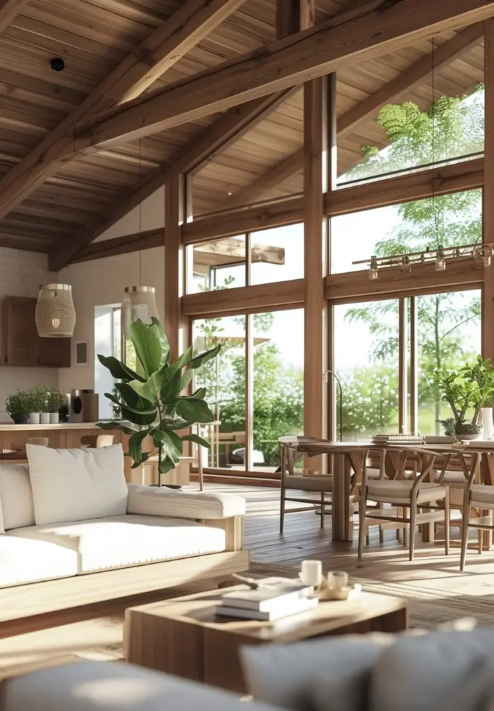
Material Rhythm Across Floors
Texture as the Quiet Designer
Matte, Satin, and Gloss in Concert
Sheen is an underrated instrument. Matte softens imperfections and creates serenity in bedrooms; satin resists wear in busy halls; semi-gloss or gloss pops trim and cabinetry with architectural clarity. Mix deliberately so highlights appear where you want attention and softness where you want calm. This balance enhances color perception, durability, and cleaning ease, without overwhelming spaces or chasing fleeting trends.
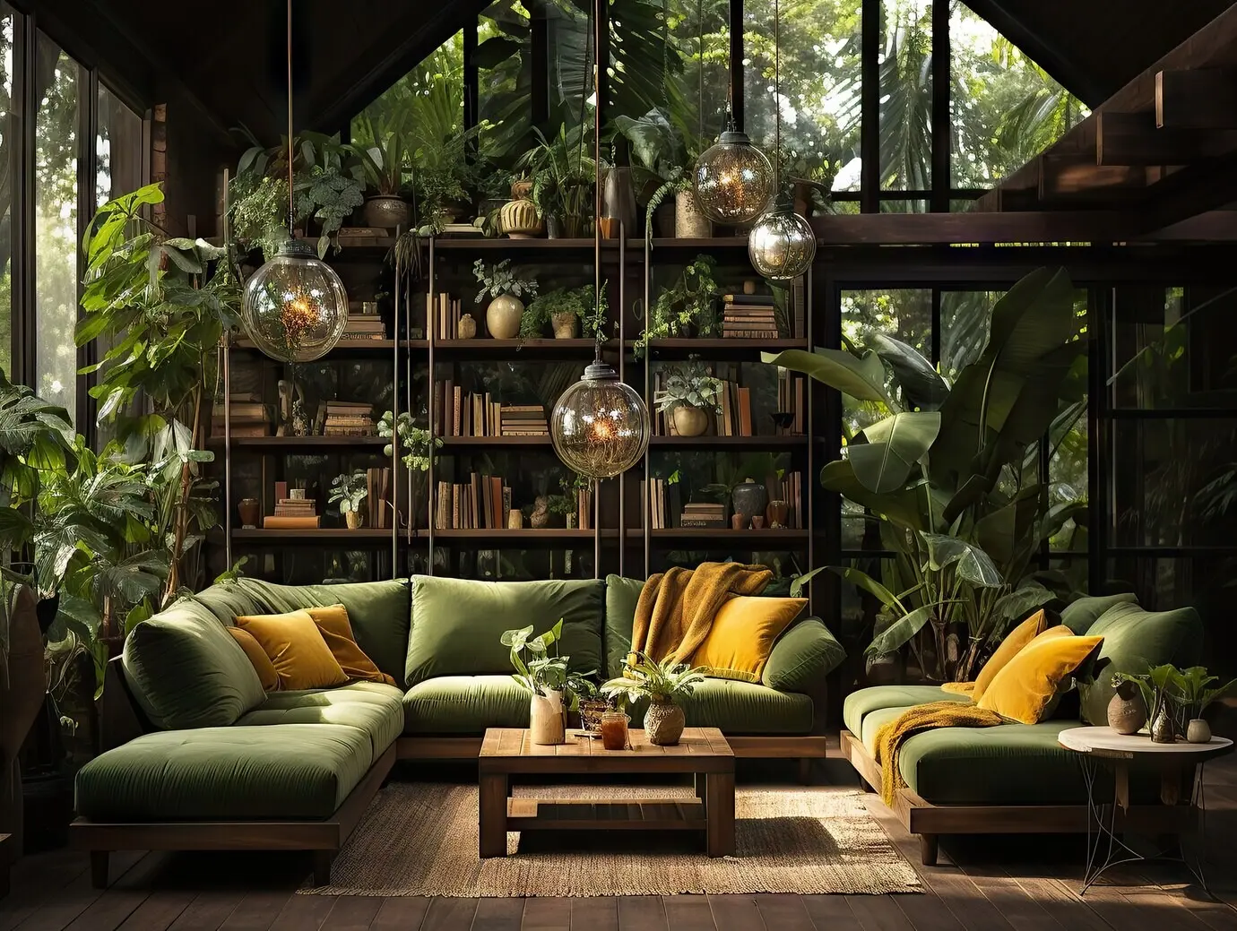
Natural Fibers and Wood Grain
Introduce authenticity with wool rugs, linen drapery, and solid wood grain that carries quiet movement across rooms. These materials age gracefully and complement paint colors by supplying depth the eye can feel. Even restrained palettes come alive when textures vary. Try pairing a smooth plaster wall with ribbed upholstery, allowing light to rake surfaces and create dimension throughout the day.
Stone, Tile, and Grout Tone
Stone and tile carry both color and micro-texture, while grout quietly influences the whole read. A slightly warmer grout can soften crisp ceramics; a cooler one sharpens geometry. Repeat a subtle stone fleck in countertops, hearths, or niches. These echoes keep spaces related without feeling identical, and they support long-term maintenance because natural variation hides wear gracefully and beautifully.
Light, Mood, and Paint Science
Real-World Story: A Split-Level Reinvented
01
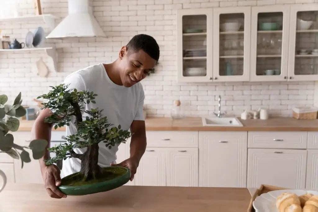
A Palette Conversation at the Kitchen Table
We taped big color boards along cabinets, laid fabric swatches on the table, and spilled coffee once, which became a lesson about realistic finishes. The family voted with sticky notes. Kids loved the inky blue island; parents wanted calm walls. Our compromise used clay walls, blue on the island, and oak stools—three anchors appearing repeatedly, each space personalized thoughtfully.
02
Unexpected Hero: The Stair Rail
A tired, orange-toned rail cut the house in half visually. Rather than replace it, we stained it deeper to echo the island’s blue shadow and oiled the treads for natural warmth. Suddenly, upward sightlines felt intentional. That single gesture linked entry, landing, and loft, proving one strategically repeated element can stitch spaces together more powerfully than costly, disruptive demolition.
03
The Two-Week Touch-Up Plan
After living with changes, small tweaks surfaced. We shifted lamp bulbs to 3000K, swapped a glossy vase for a matte bowl, and added a woven runner to calm the hallway echo. Two weeks of light adjustments polished everything. Built-in review time honors real life, reduces regret, and ensures choices serve routines, not the other way around, every single day.

Cohesion Without Boredom

The 60/30/10 Proportion That Actually Works
Pattern Scale: Curtains vs. Pillows

Metal Finishes That Harmonize
Palette Spec Sheet Your Contractor Will Love
Summarize every finish with brand, code, sheen, room placement, and edge cases like inside closet doors. Add cleaning instructions and touch-up plans. When contractors understand intent and details, they protect continuity at every step. This one document prevents missteps, clarifies responsibilities, and saves money while translating your vision into shared, repeatable standards that busy crews can actually follow.
Ordering Schedule to Avoid Delays
Lead times shift. Place orders for flooring, tile, and specialty lighting before demolition, pad paint quantities generously, and keep alternates listed. Schedule deliveries to match phases, not convenience. Label boxes by room for speed. These simple habits keep momentum steady, protect budgets, and preserve your carefully built color and texture plan when timelines wobble or supply surprises inevitably surface.
Neighborhood Feedback and Future Resale
Ask friends or neighbors how daylight behaves on your block and what finishes have worn well in similar homes. Their experience can preempt misfires. If resale matters, prioritize cohesive neutrals and add personality through art and textiles. Share your favorite combinations in the comments, subscribe for upcoming palettes, and tell us what you’d like explored next time across materials and lighting.
All Rights Reserved.